Choosing interior paint colors is one of the cheapest ways to change how a home feels, but with practically unlimited shades to choose from, it's easy to get stuck. This guide covers how to narrow down a color scheme, popular palettes by mood, specific shade suggestions for the most-used colors, and real room examples to borrow from.
In this guide
How to choose your interior color scheme
Before picking specific shades, it helps to know the two broad categories colors fall into:
- Neutrals — suitable for homes where furniture and decor change often, since these shades go with almost anything and don't force a repaint every time you redecorate.
- Bolds (blue, red, green, yellow) — look best in rooms with good natural light; in darker rooms, use a bold shade as a single accent wall instead of going all-in.
From there, four approaches tend to work well:
- Explore newer shades. Browse home interior catalogs or apps like Pinterest for trending combinations, or bring in an interior designer to assess the space.
- Try your favorite shades. There's nothing wrong with sticking to a color you already love — just shuffle between a few shades of it to avoid a flat, mono-tone look.
- Use a color wheel. A color wheel groups shades by family, which is the same tool professional designers use to pair complementary colors without studying color theory.
- Look for inspiration in the wild. Restaurants, art galleries, and showrooms are free sources of color pairings you can borrow and adapt.
Popular color schemes by mood
Earthy shades
For homes with wood tones and good natural light, a brown-and-off-white palette feels warm and comfortable without much effort. Shades of brown and white complement each other and open up a space.
Sky blues
Aqua, baby blue, light blue, and navy blended with white or cream give a room a calm, airy feel.
Dusty neutrals
Shades of grey, even darker ones, pair especially well with white furniture and make a room feel more considered without being cold.
Color-by-color shade guide
Whites
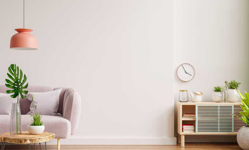
White brightens a room and makes it feel larger, and it comes in far more shades than plain white: Alabaster, Shoji White, Snow White, Off-white, and Pure White are all common starting points. It's prone to showing stains, so a glossy or semi-gloss finish is easier to keep clean.
Blues
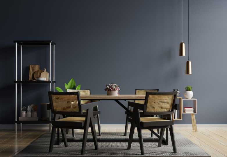
Blue works in almost any room — lighter shades suit bathrooms, darker ones suit bedrooms and lounges. Common shades include Light Blue, Sky Blue, Navy, Azure, Electric Blue, and Sapphire.
Grays
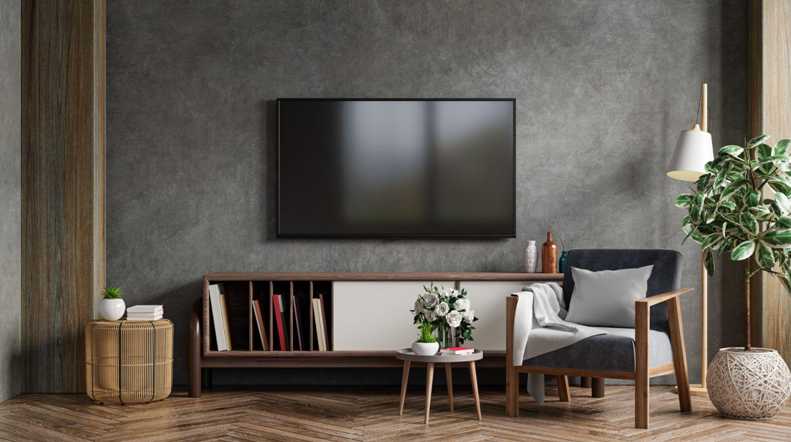
Gray works in nearly every room of the house. Try Cool Gray, Agreeable Gray, Pavilion Gray, Owl Gray, Rockport Gray, Ash, Smoke, Abalone, or Iron — darker and lighter grays pair well together without needing a third color.
Browns
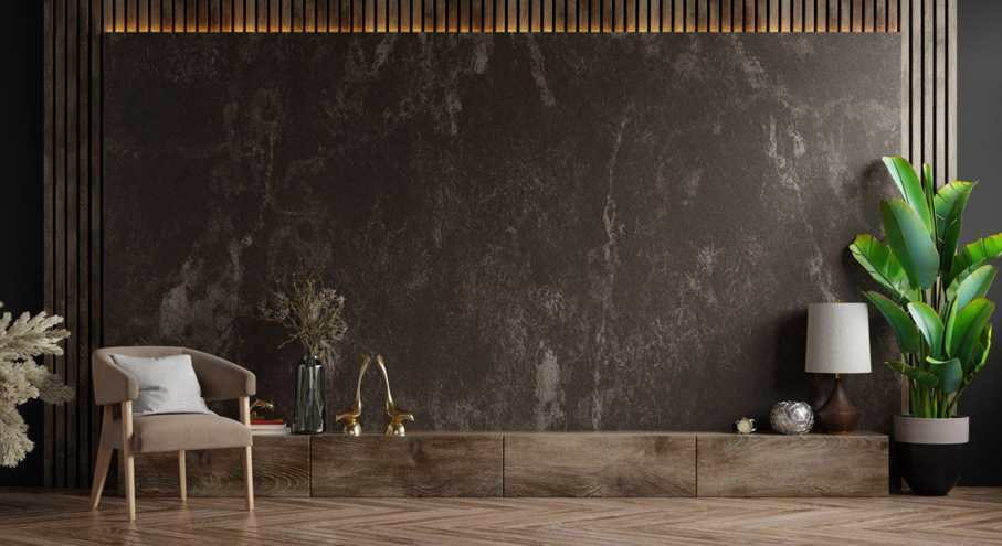
Brown can look dull in the wrong light but brings warmth and depth in the right setting. Coffee, Walnut, Caramel, Chocolate, and Tawny are reliable, layerable shades.
Purples
Lavender, plum, and magenta all read as purple with different amounts of warm or cool undertone — blend two or three, or use one as an accent wall.
Yellows
Yellow works best as an accent rather than an all-over color unless the room gets strong natural light. Mellow, Cyber, Banana, Tuscany, and Honey are softer starting points that pair well with white and gray.
Oranges
Orange makes a room stand out and works well when the furniture is kept simple. Tangerine, brown-tinted orange, Carrot, Apricot, and Sweet Orange all read as more sophisticated than a straight primary orange.
Real room examples
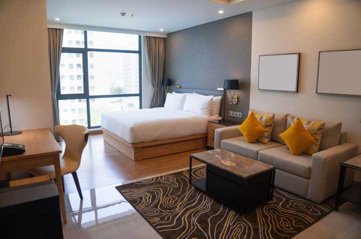
Beige with accent brown
A comforting, cozy combination for a bedroom or living room.
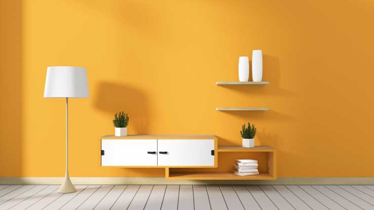
Yellow accent wall in a sunroom
A dim yellow feels energizing without overwhelming a kitchen or lounge.
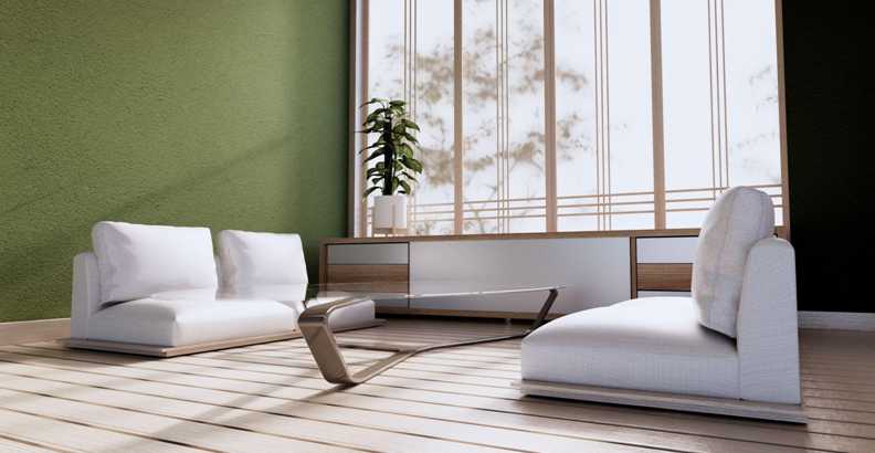
Green for a sitting area
Green brings a relaxing, nature-adjacent feel similar to blue's calming effect.
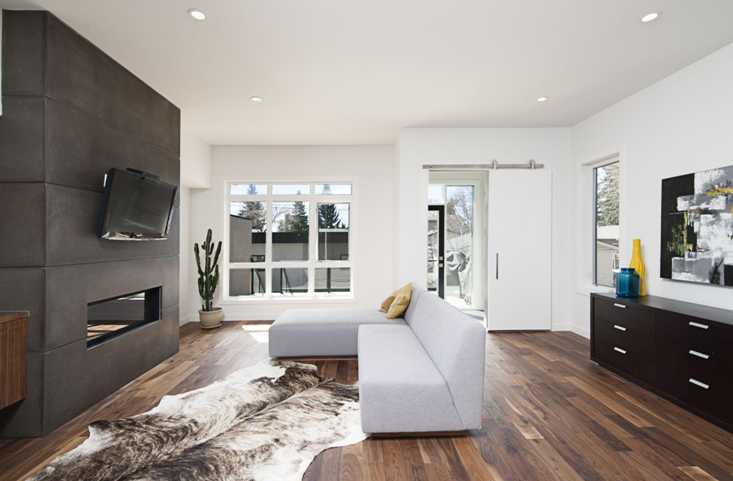
Charcoal black accent wall with white
Mixing a dark accent with a light color gives a room a decisive, welcoming look.
All-white walls
White brightens and opens up a space whether used on every wall or just a portion.
Gray walls
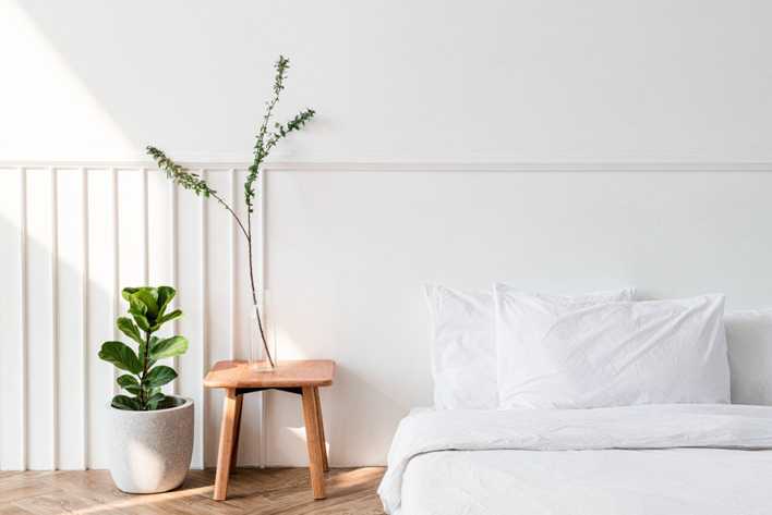
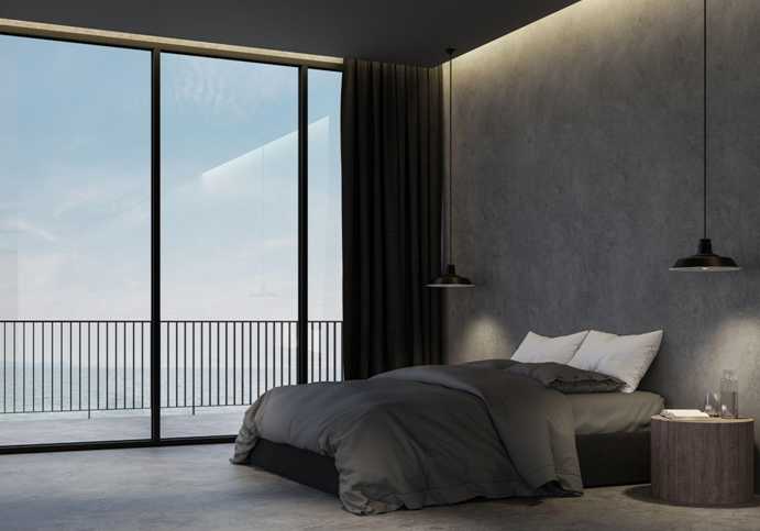
Gray fits nearly any room and gives a slightly more conventional, "home" feel than bolder colors.
Conclusion
A good rule of thumb: whatever color you land on, use three shades of it in the room — a light, a medium, and a dark, split between walls, trim, and furniture or accents. In a small room, lean lighter to keep it feeling open; in a larger room, darker shades can add coziness without feeling cramped. Repainting every three to five years is enough to keep a home feeling current without redoing it constantly.